A-League Breaking News
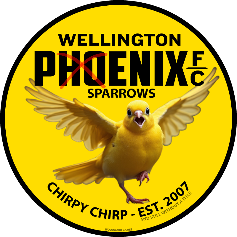
In a twist of fate, Wellington Phoenix has decided to ditch their fiery namesake for something a bit more … chirpy. After their embarrassing defeat on their home ground by Auckland FC, they’ve swapped out their majestic phoenix for a … wait for it … a yellow sparrow in their club logo. We were leaked the first public image:

And, we also have exclusive access to how it went down:
The Wellington Phoenix board, in a moment of sheer brilliance, decided it was time for a change.
“Phineas the Phoenix,” they said, “is just too high-maintenance with all that fire and symbolism. What we need is something that truly represents Wellington – small, chirpy, and ever-present in our coffee breaks!”
Thus, the yellow sparrow was born. The new logo features this tiny bird, wings spread not in the majestic flight of a phoenix, but more like it’s just discovered the wonder of a particularly good breadcrumb.
For some reason there is a red cross over the H and O in the word Phoenix … that would make it Peni … oh wait!
The Te Reo Māori (language) has been replaced due to the club no longer having any Mana. It is now Chirpy Chirp which is more appropriate for their level. Underneath the Established 2007 wording, an additional line of text has been included … “and still without a title” to reflect reality.
The announcement of the new club logo was met with a mix of confusion and the fans were like, “From the ashes of defeat, we rise to … um, peck at some crumbs?” The official statement from the club read, “Chirpity chirp chirp chirp.”
The sparrow, officially known as “Sparrow MacFlap,” has quickly become the talk of the town. Merchandise sales have finally soared for the club breaking their previous record of 10 shirts sold in their inaugural season. Even the local baristas down on Lambton Quay have gotten in on the action, offering “Yellow sparrow Lattes” with tiny bird-shaped foam art on top of the … yellow beverage (Why is it yellow? Can’t be like that snow thing).
The team’s chant has evolved too. What was once a powerful roar of “Rise, Phoenix, Rise!” has now become the slightly less intimidating, “Chirp, Sparrow, Chirp!” – which, if you’ve ever heard a sparrow, is more of a gentle reminder than a battle cry.
The Yellow Fever supporters group, never missing a beat, have now embraced this change with open arms. On match days, you can hear them tweeting from the stands, “Sparrow MacFlap, Flap, Flap, Flap, You Can’t Stop Our Yellow Clap!” (Um, I wonder what clap they’re referring too).
The fact that Wellington Phoenix … or should that now be, Wellington Sparrows will be playing at the Wellington Cake Time, at least the sparrows will have a good spot for some post-game crumbs to ease their sorrows.
What do you think of the Wellington Sparrows change of logo?


